-
Challenge
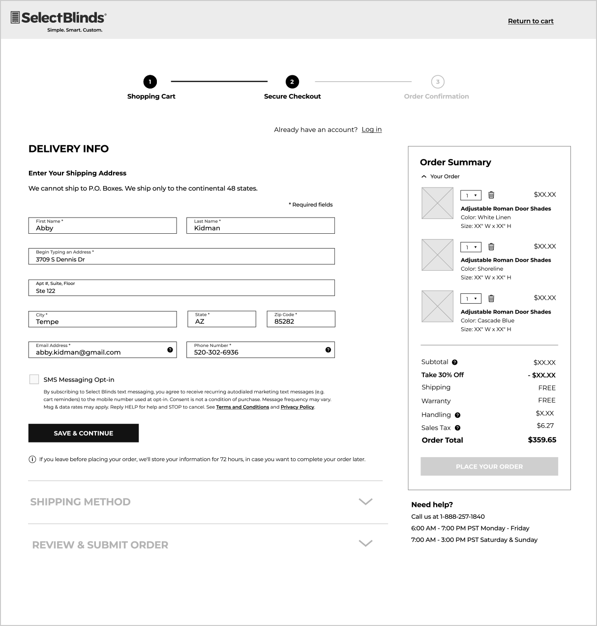
Take an overwhelming and dated checkout flow and introduce new branding and design system that will improve the overall checkout experience. According to Baymard Institute, the original state of the SelectBlinds' checkout experience was “mediocre” and sat in the bottom 60% of the e-commerce sites in Baymard’s benchmark.
As a business, we wanted to provide a checkout experience that was not overwhelming and was easy to understand, reducing the risk of checkout abandonment. -
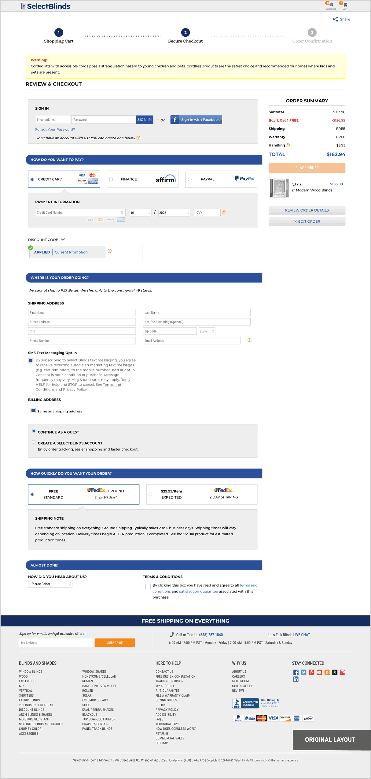
Solution
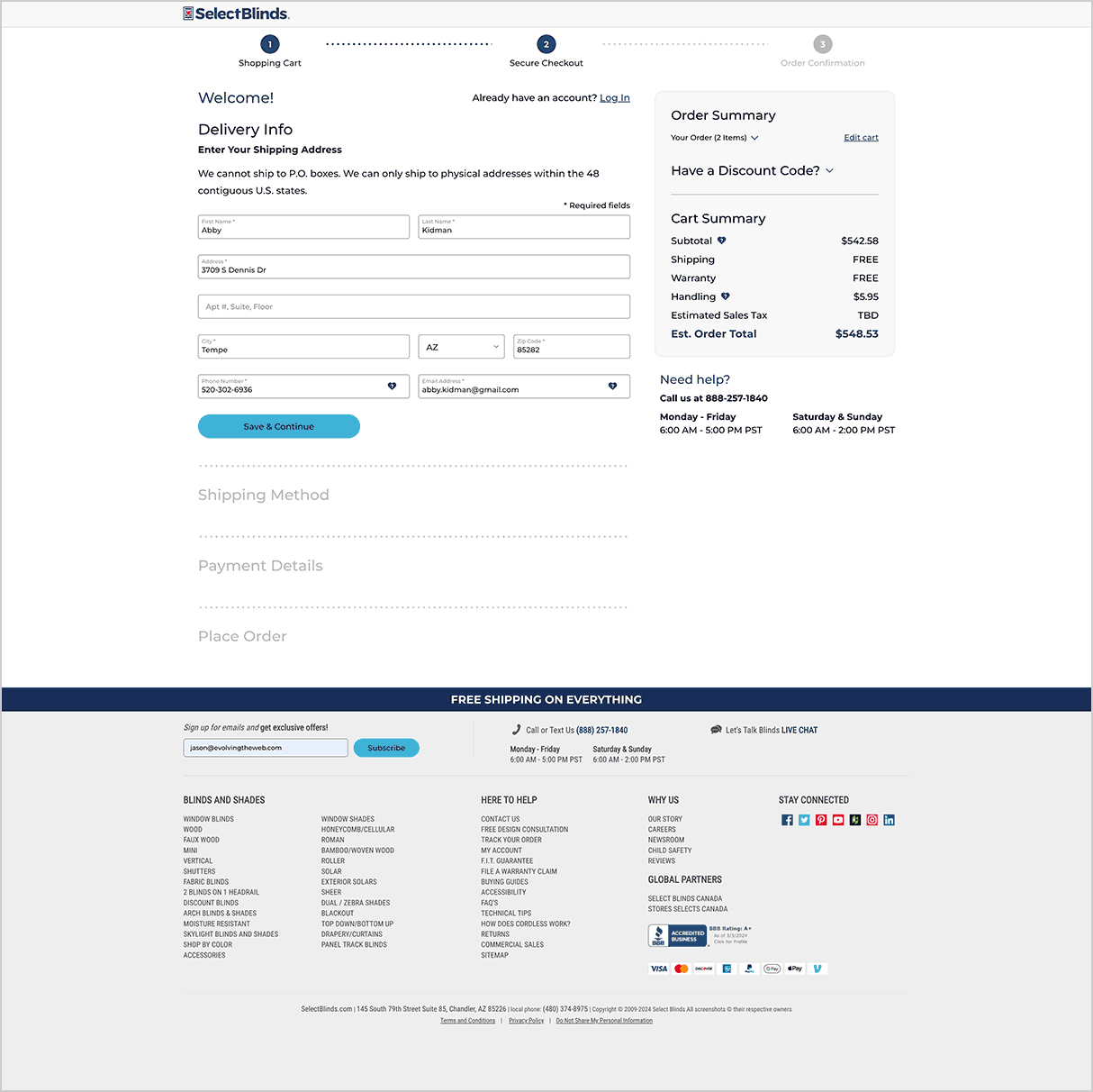
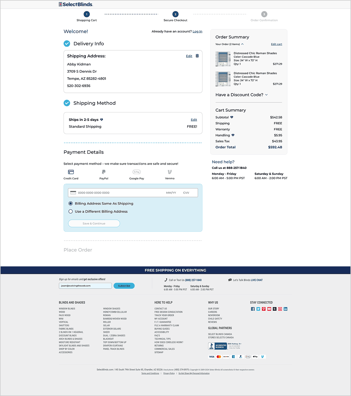
Using Baymard Institute's audit recommendations, industry research including competitor analysis, and usability testing I designed a simplified user experience that guided the user through the checkout process.
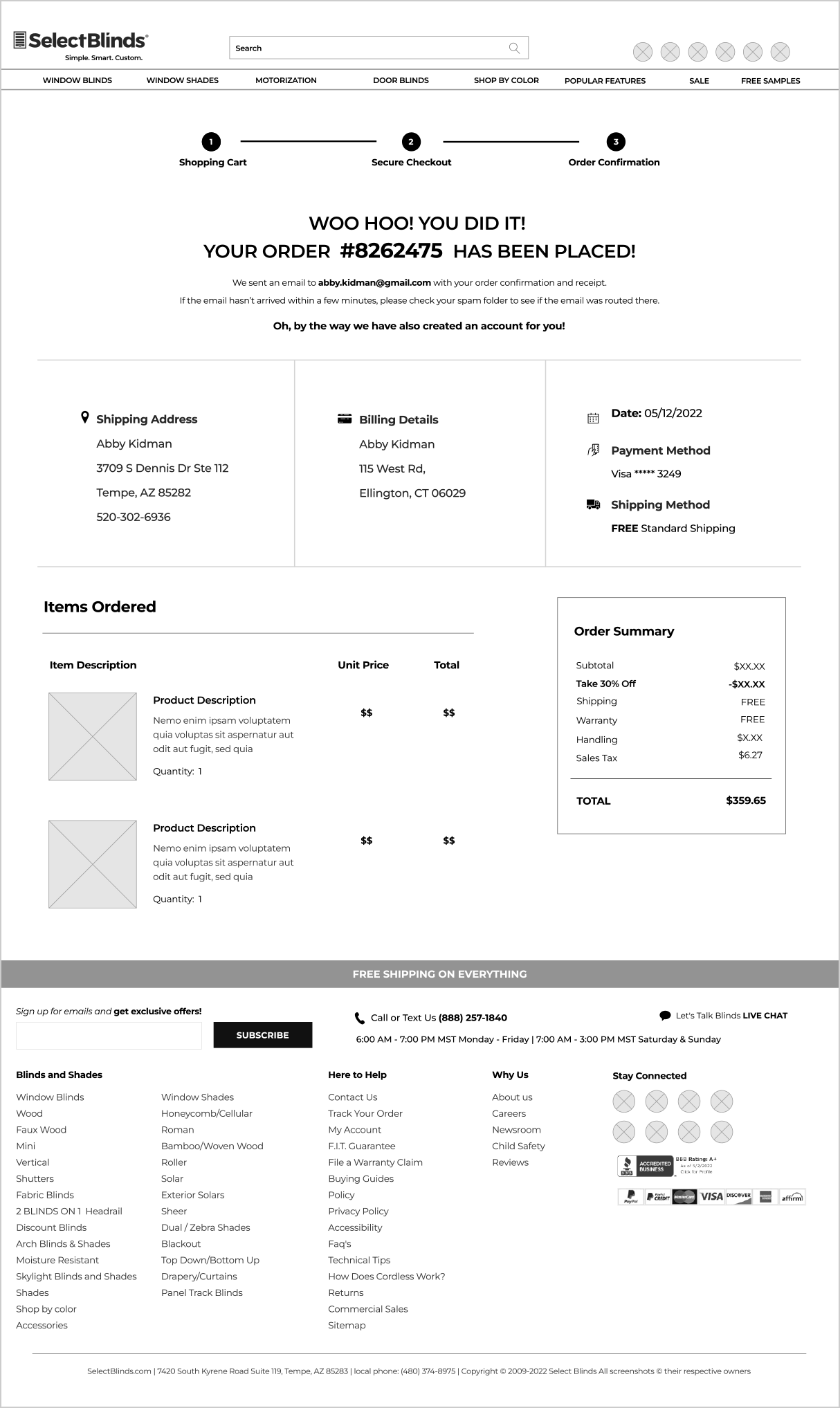
The checkout process was updated from a one-step experience to a single page, multi-step (accordion) approach. This ensured that the user knows exactly what is needed to do at each step of the way. This approach also allowed for in-process backend validations to reduce fraud and selling to unapproved destinations. -
Monitor & Improve
Through reviewing of user recordings and data analysis, areas of improvement were discovered to improve the checkout experience and to prevent unnecessary drop off. After deployment of design updates:
• Overall checkout completion increased by 39%
• Mobile checkout completion increased by 33%
• Overall conversion rate on Desktop went up 38% and Mobile conversion was up 34%