-
Challenge
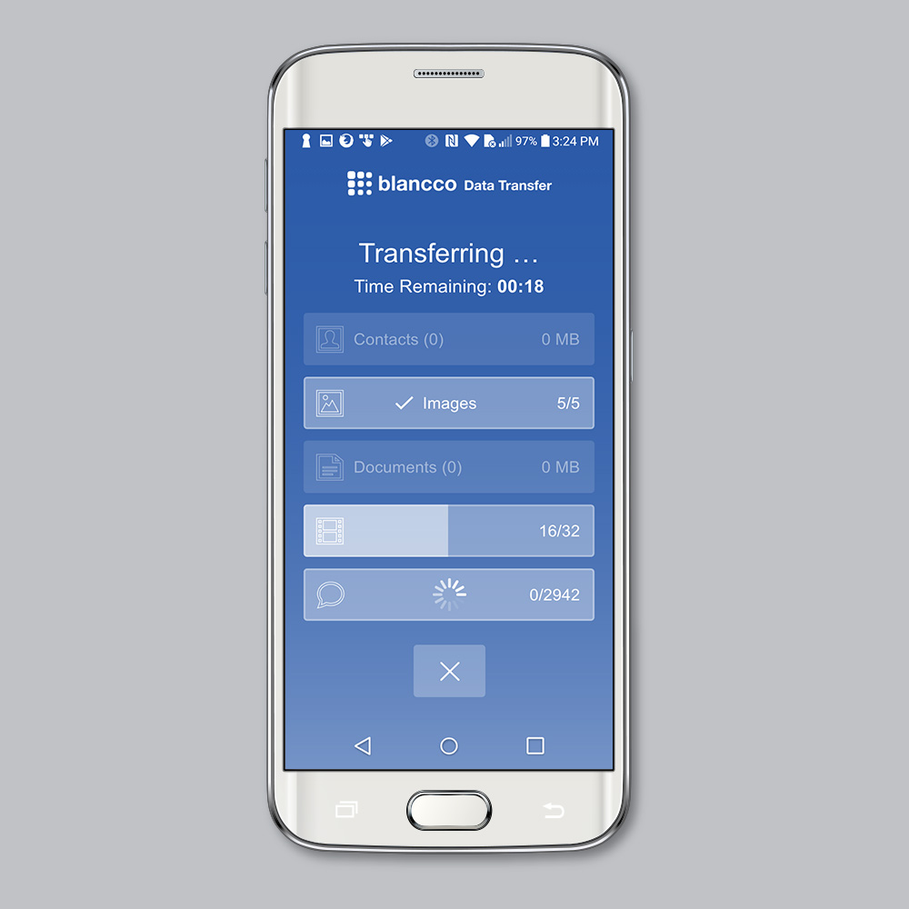
The Mobile Diagnostics development team created a customer-facing data transfer application for mobile customers to use without having to visit a retail location for assistance. The new solution would be accessed via an app store download, for both Android & iOS devices. The interface needed to be easy to use and not overwhelming, especially to a novice user. It was determined that this Data Transfer process would be rolled into an overall Mobile Solution app in the future, so the look and feel would need to be versatile.
-
User Journey, Wireframes & Testing
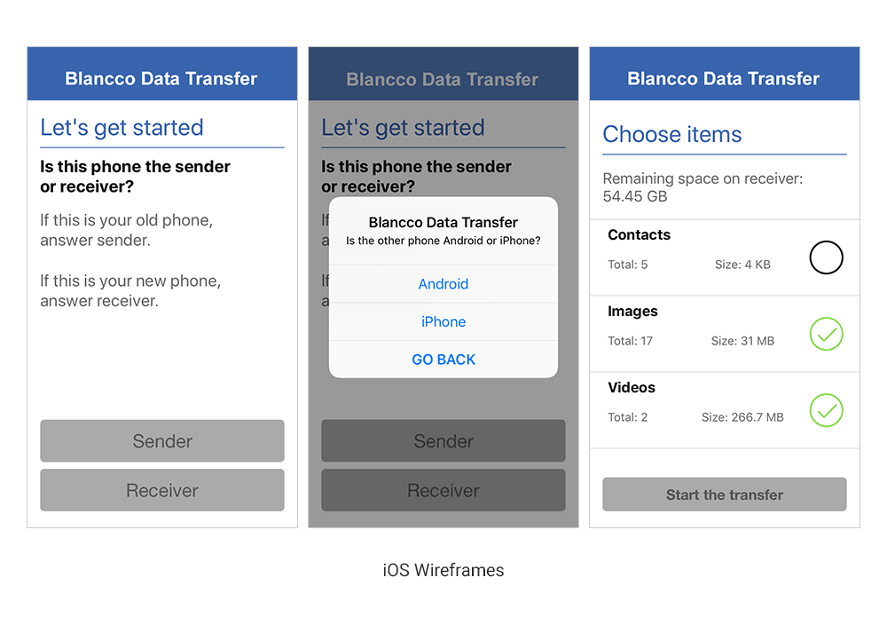
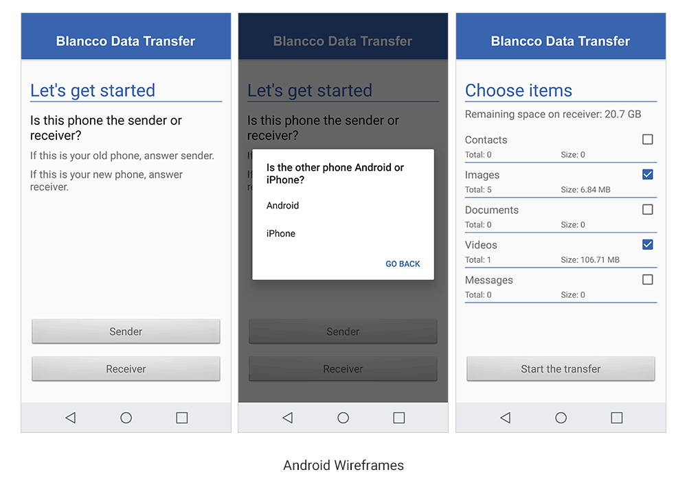
After requirements gathering and discussion with key stakeholders and the development team, a user journey was created to map out the flow from application download to transfer completion. Prior to creating a high-fidelity prototype, basic wireframes were created for development and release of an alpha version of the transfer application. This also allowed engineering to begin testing the functionality from start to finish. User testing consisted of in-house monitored recordings from internal testing group which gave the team critical feedback on the final iteration.
-
Solution
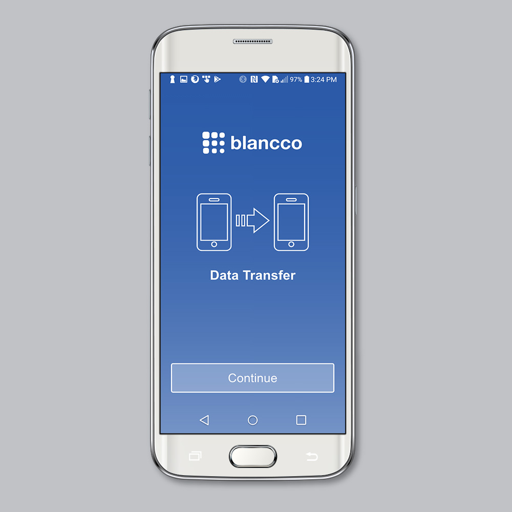
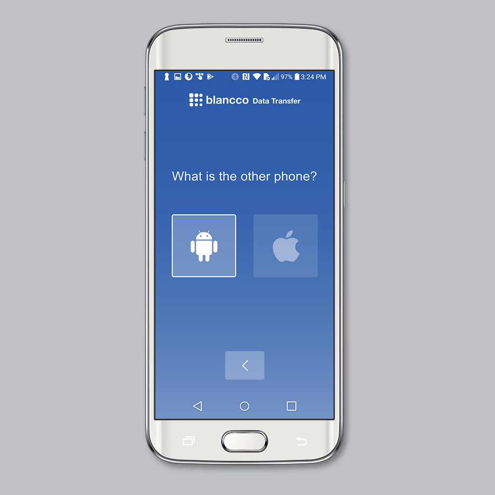
The final design concept was a fresh approach to the diagnostics brand. While still following the overall brand requirements, the interface took on a slightly different feel since it was a customer-facing application. When customers cannot understand what to do, they panic. This leads to customer dissatisfaction and abandonment. The design provided clear and concise messaging while keeping customers engaged; empowering them to manage their own data transfers between devices without having to travel to mobile retail location for help.
-
Monitor & Improve
Through reviewing of user recordings and data analysis, areas of improvement were discovered to improve the checkout experience and to prevent unnecessary drop off. After deployment of design updates:
• 20+% month-over-month avg. app download in the first three months
• 18% decrease of support calls directly tied to the application

