-
Challenge
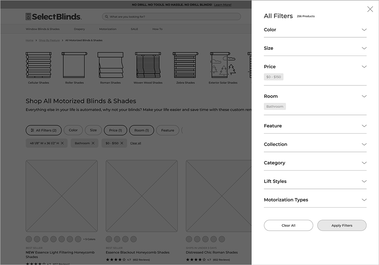
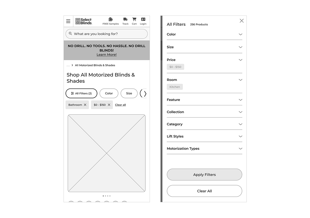
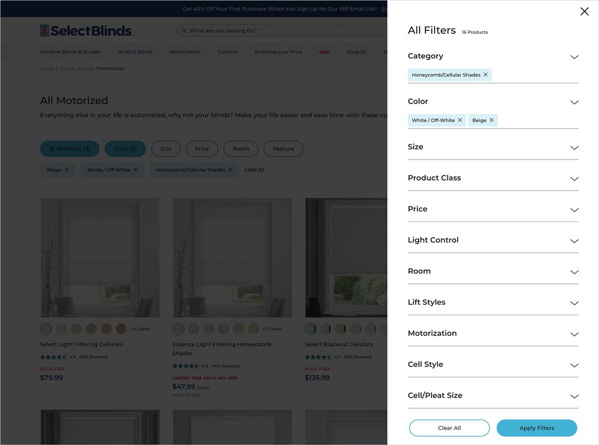
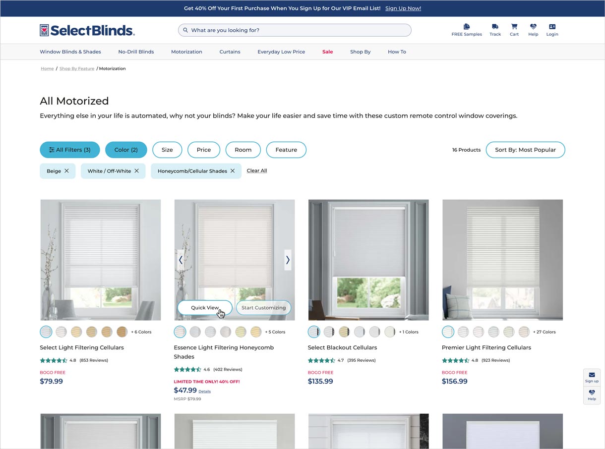
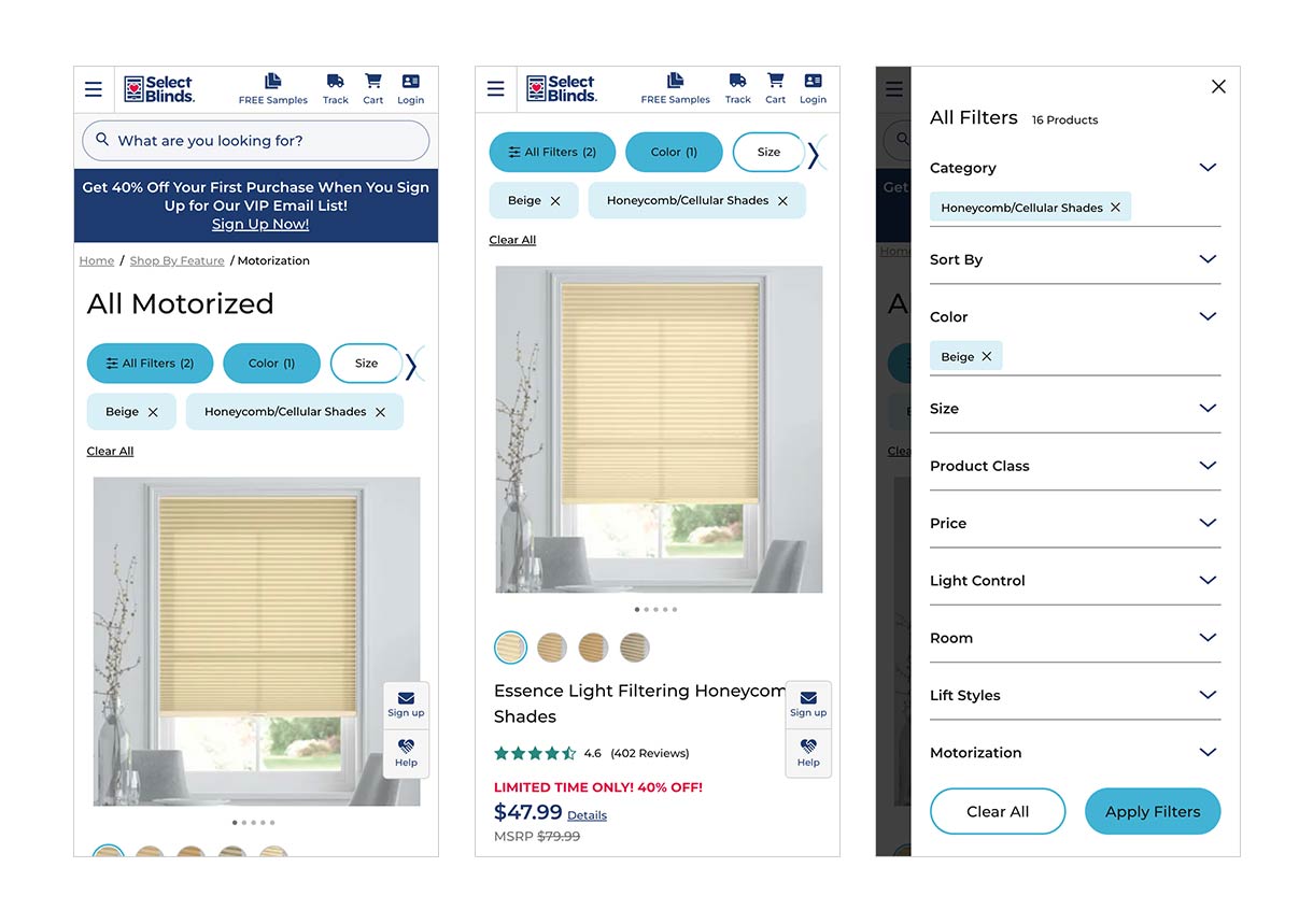
According to Baymard Institute, the original state of the SelectBlinds' product list & filtering experience was “good”, but improvements should be made to strengthen the UX performance of the layout and filtering areas. The page was dated and was was very overwhelming to the user. The user was unable to what filters were being used, and frequently caused the user to "dead-end" their match selection.
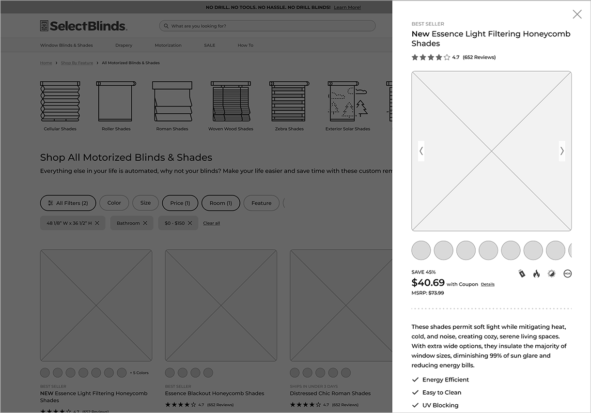
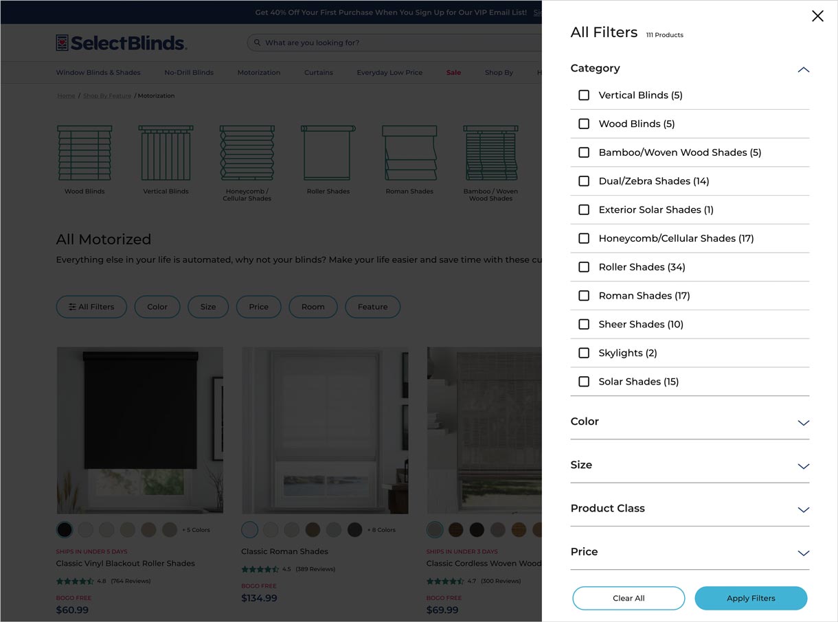
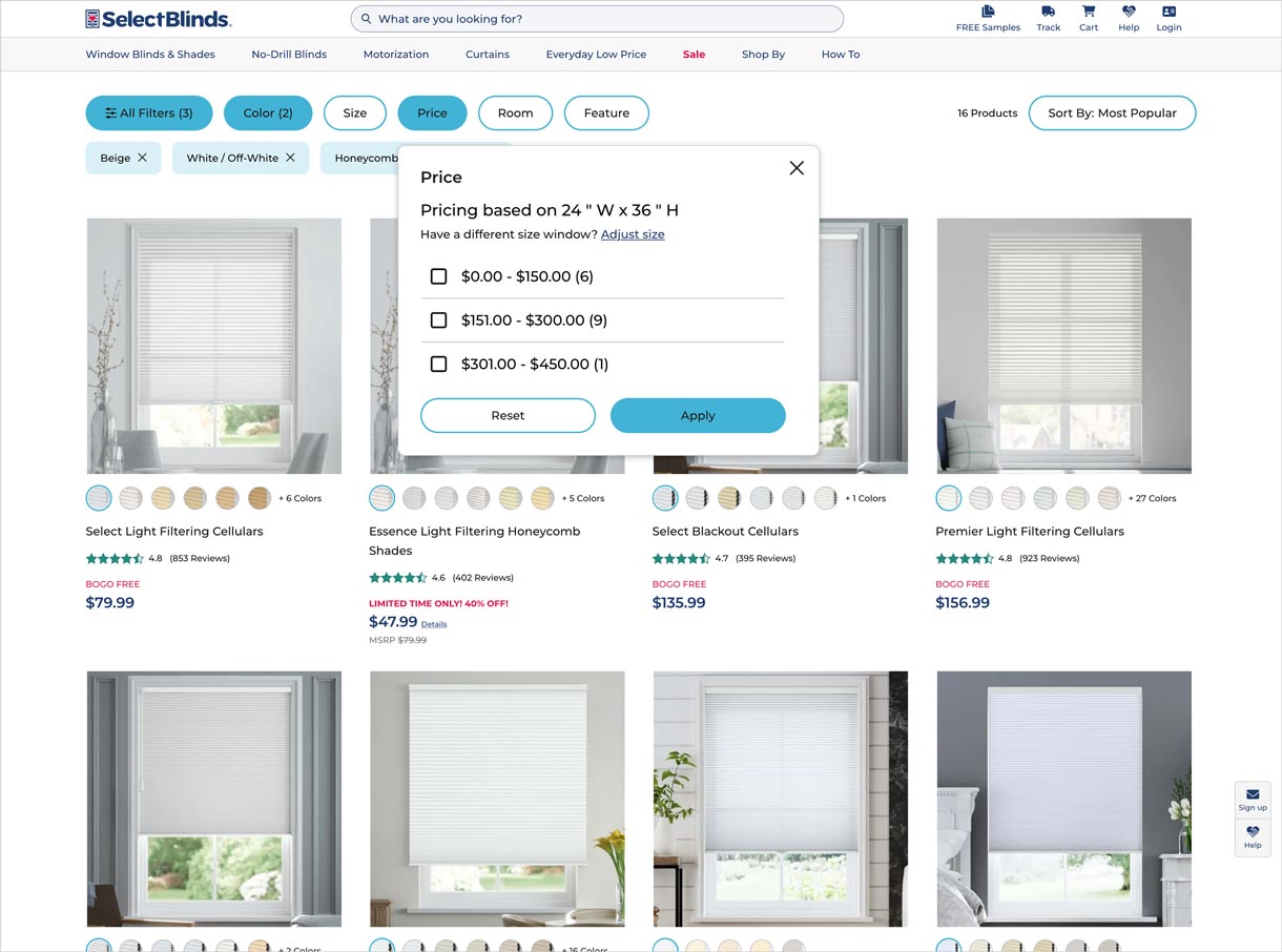
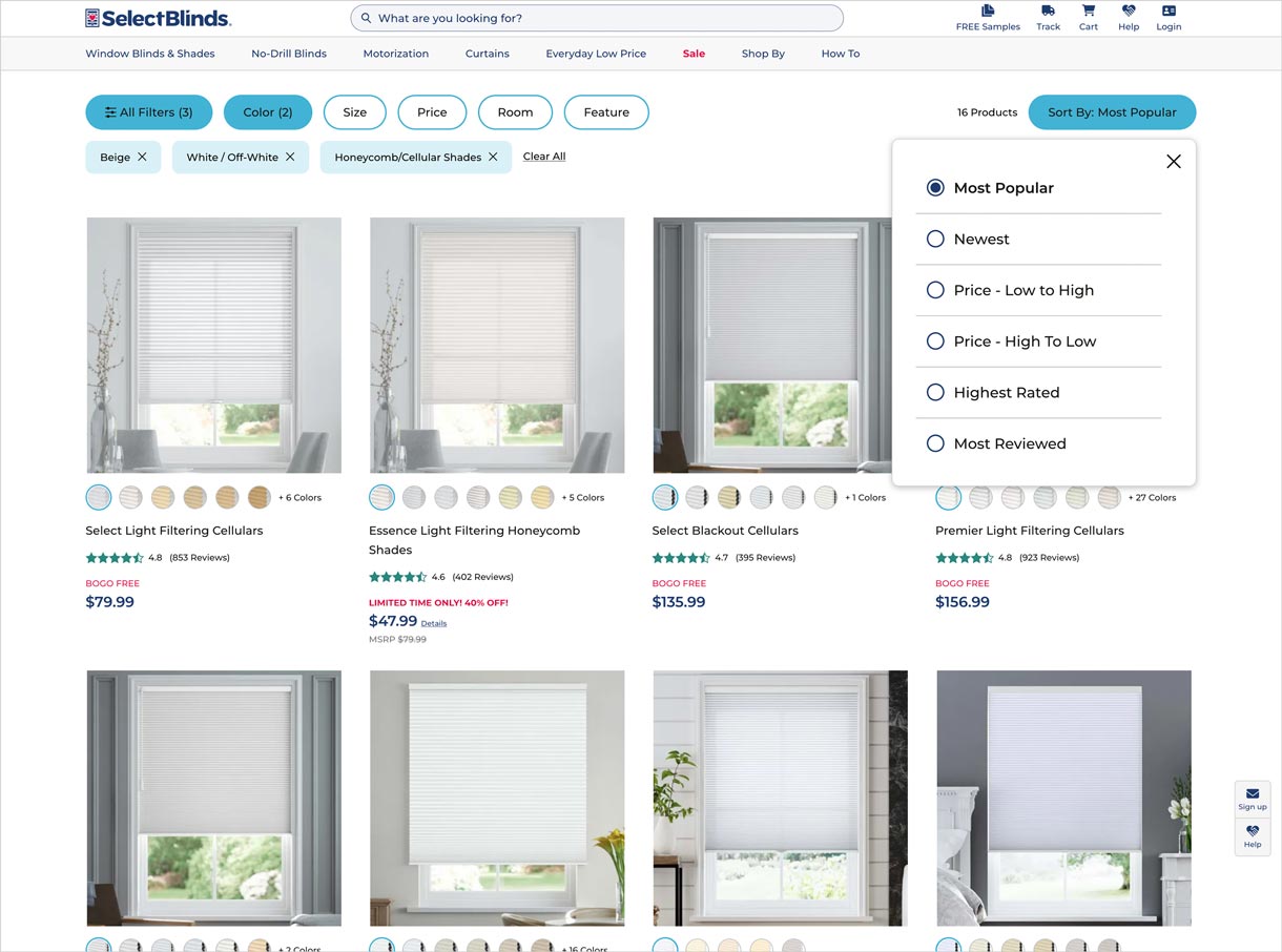
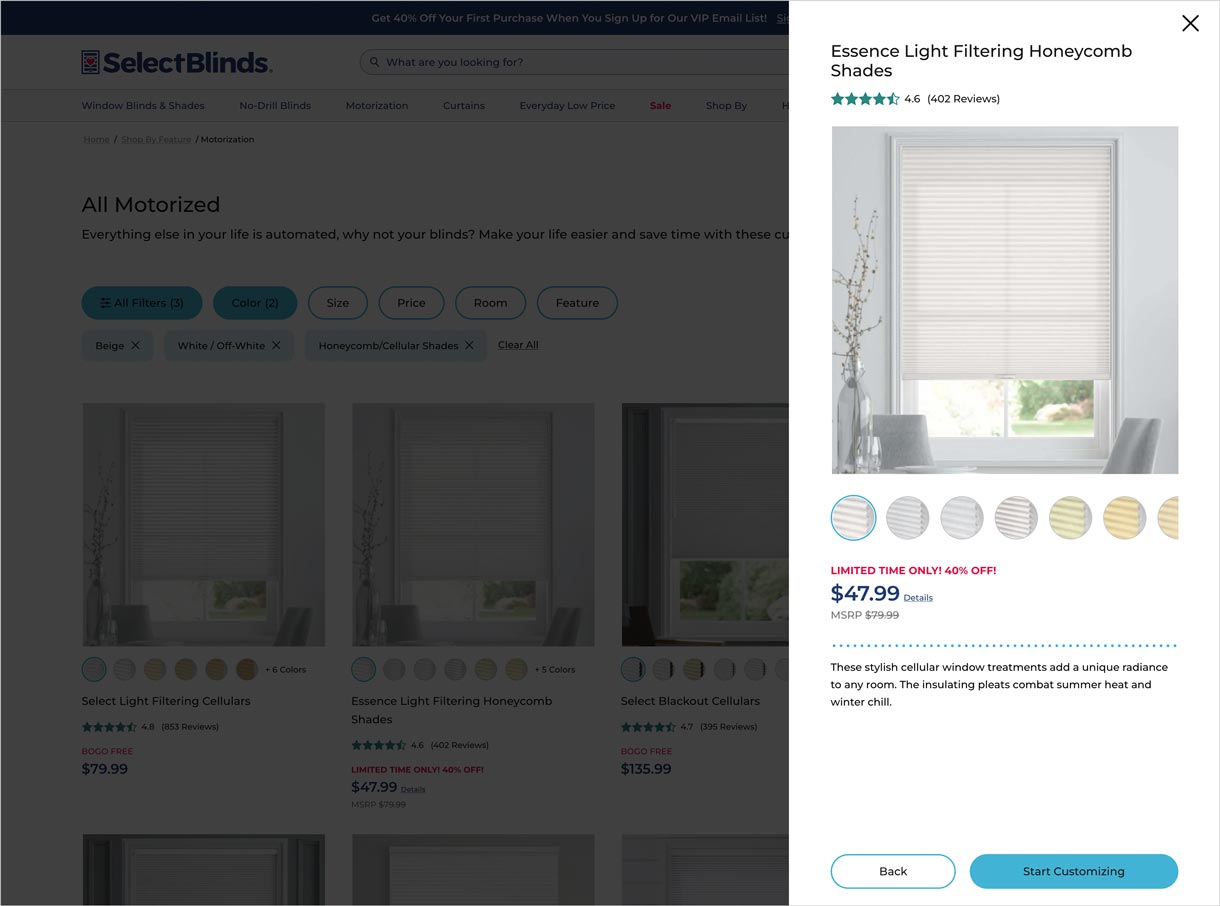
As a business, we wanted to provide an experience that enabled the user to shop a list of products within a category or subset of categories and be able to filter, sort, and preview those products without leaving the page. -
Test
In just over a week of testing, statistical significance was met. The primary goals of the test were to improve the click-through rate (CTR) from the product listing page (PLP) to the product detail page (PDP) and reduce the bounce rate / visitor abandonment.
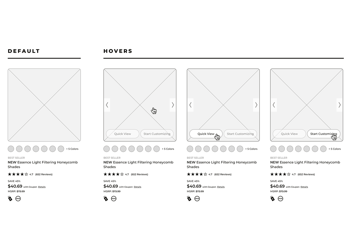
• Traffic to the PDP via the "Start Customizing" call-to-action increased by 150%
• Bounce rate reduced by 2%
• Overall page clicks increased by 44% -
Solution
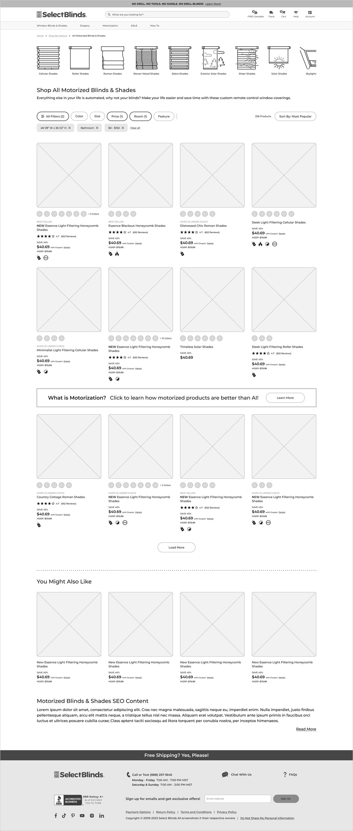
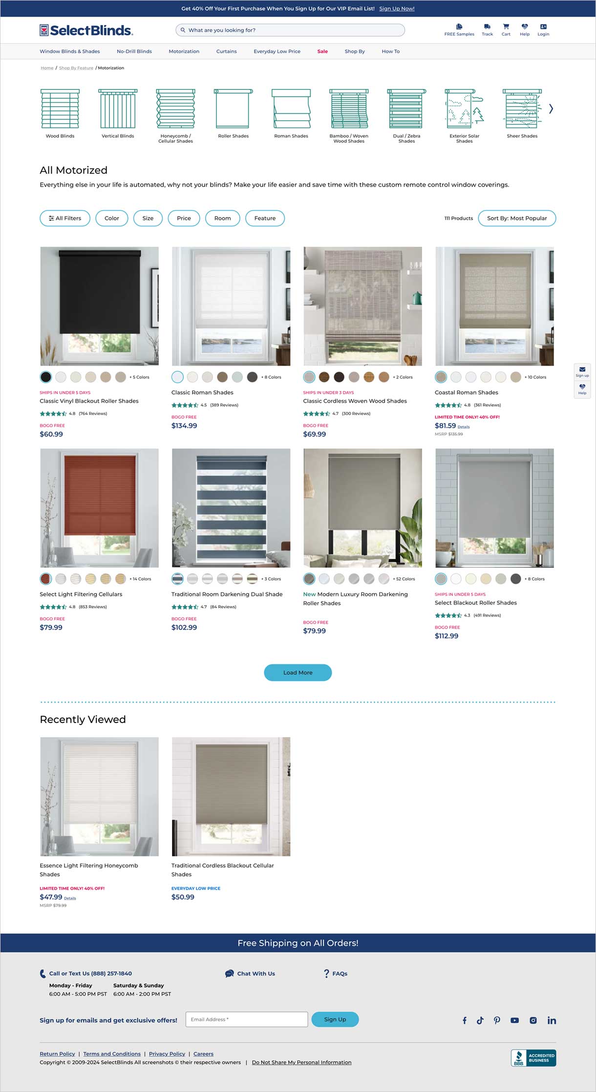
Using Baymard Institute's audit recommendations, industry research including competitor analysis, and A/B testing I designed an experience that further educated the user, allowing them to easily filter and sort by features, preview product details and see relevant promotions or messages that will help improve their overall user experience.
The PLP was simplified and modernized to drive more users to interact with the filters and ultimately click thru to the PDP.
